This is a bit off topic, I am sharing the things that I have learned while doing mapping using Google map.
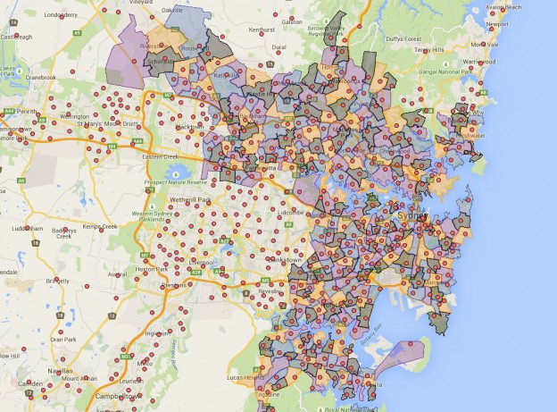
The default marker is monstrously big and it is fine when you only have a few of them. However if you like me already up to around 600 and will going up more in the future. The map when zoomed became a bit of a mess. The default market is not only just 32 by 32 pixel, the shape of it also make it rather large.
If you export the map into kml and look at the actual file, you will notice that bits look like following
<IconStyle>
<color>ff3644DB</color>
<scale>1.1</scale>
<Icon>
<href>http://www.gstatic.com/mapspro/images/stock/503-wht-blank_maps.png</href>
</Icon>
<hotSpot x=’16’ y=’31’ xunits=’pixels’ yunits=’insetPixels’>
</hotSpot>
</IconStyle>
The url is what marker graphic will be used, there are a lot of them available, the default one is 32 by 32 pixel which is in my view really too big for a lot of applications.
Here is a smaller sized red circle marker
https://storage.googleapis.com/support-kms-prod/SNP_2752125_en_v0
I started using the new marker, however the marker does not stay in the same spot on different level of zoom. Same does not seem to apply with the default market. After a bit of research, look like the market need to be “anchored” to fix this issue. Then it is off to more “research” which is really google searches. I finally find the answer, it is the
<hotSpot x=’16’ y=’31’ xunits=’pixels’ yunits=’insetPixels’>
The kml exported by default uses pixels and it is for the 32 by 32 pixels marker, so when you use a smaller marker you will the markers moving when zooming. The easiest solution I find is just change to use fraction in the hotspot tag as following.
<hotSpot x=’0.5′ y=’0.5′ xunits=’fraction’ yunits=’fraction’>
So after a couple hours of work, now I finally got rid of that gigantic default markers. Enjoy the new mid life upgraded Sydney Public School full catchment map by following this link.